
Saturday, October 11, 2008
- www.infiniteexpanse.net: I really like the design for infinite expanse. The site name, does not sit horizontally across the top of the screen, the designer uses this space for his content links. Instead the title goes vertically down the top left of his page and his title, in a sans-serif font, sits atop a sillouet tree scene which runs down his entire page like a scroll. This gives the site a minimal and modern look. While his layout is unusual, he has an interesting illustration, which runs perpendicular to his site title, I think it is this dynamic illustration which ties the design together and makes it work well.
- www.youki.be: Youki is a site for its customers to upload their art online. The header has different black and white images which rotate. What I think is working well for the header is its pink bold script header which stands out against the dynamic photos changing behind it.
- www.thebravern.com: The header is clean, serif font, which ties together well with the hotel, The Bravern's apparent sleek and upscale identity. While the text itself is not bold, the header stands out strong, showing its scale next to the sites content.
![]()
I downloaded Rabiohead from 1001fonts.com, as the font for my new header. To create the new header I wrote "pseudonym" out twice, on two different layers. The bottom layer was a black outline of the text and the top "pseudonym" layer is a white text with the opacity at fifty percent. I made the white text sit slightly outside the black outline to emphasize the "hand done" and cartoon style I wanted to evoke from the viewer. I finished the header by adding a drop shadow.
![]()
Tuesday, October 7, 2008
1. GIF: This image could be catagorized as the website's banner/titlepage/logo/etc. The branding of company (including this image) has a fun, cutesy, cartoon style, with bright vibrant colors. These "odd" characters appear to be their trademark as they are repeated on their products. There is a cute animation of the characters bouncing up and down, so I think it is nice to see animation accompany the illustration.
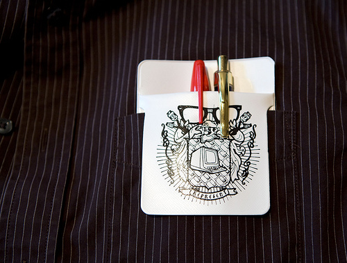
2. JPEG: This image is of a pocket protector, which was apart of a blog entry for the website, Derek Powazek - Live in San Francisco. Actually the entire design of his blog is simple, but really dynamic (there is a giant pencil-like illustration of a giant squid with small thumbnails images/links for other photography interlaced inside). Anyway the image of the pocketprotector was a cropped in shot of someone using this pocket protector in their front pocket with pens inside it. The cropping job makes the image clean, clear, and informs the reader of the content of the entry without boring the audience.
3. PNG: This example of a PNG is a small detail from the graphic design agency, Foxie's portfolio. The concept of the site is a bookshelf on a wall and the navigator can see the designers print, identity, web, packaging, or photography portfolios by clicking on the different books. This "about us" detail with the broken pencil and doodle is an opportunity for the viewer to get a brief glance into the designer's creative process.
![]()
 I got this image off the website: http://www.farmidable.com/desktop-wallpapers. Clearly since it is an illustration it would be best optimized as either a gif or png, and not a jpg file. I choose to upload it as a gif because the file size was smaller.
![]()

I created this image entirely on the computer using the program Corel Painter. Since this image was not a photo, nor was there a lot of detail I did not feel that it should be uploaded as a jpeg. Unfortunately the gif format slightly pixelated the the image and did not caputre the color as well as the png file which looked the same as the original image.
![]()

This picture of the flowers on the dock with the buildings behind it was taken this summer in Amsterdam during my travels in Europe. The essence of the original image is similar, the original image shows more of the building in the background and the water, but the focus for the viewer is now cleaner and more clear. I cropped in on potted flowers/dock/boat, because that's what I was most interested in when I captured the image. The height of the building, it's additional windows, and other information in the photograph distracted the viewer from what I wanted to illuminate. Originally this was a color photo, and I chose Photoshop instead of Fireworks to edit the image. Aside from cropping, I also used Photoshop's lens option to put an orange filter over the image, took away the remaining color to make it sepia. Then I used the dodge and burn tool to dramatize the photo which makes it more interesting. Since the image is monochromatic I optimized it not only as a jpeg, but as a gif and png too. I choose to keep the file as a jpeg because the dodge and burn detail I added to the photograph showed up best in the jpeg format. As a gif and png, the slight variations in color were not coming through as well. When I was editing this photograph I wanted to practice primarily on the creation of the border. That is why I only made minimal changes to original photo. Besides cropping out bushes in the images foreground and some excess of the images' landscape, the essence of the photo remains intact. For the photograph's coloring I lessened the brightness, contrast, and saturation because the color pallet of my blog design has earthy tones and an overall lack of color saturation. I used Photoshop to edit the image and make its border and used the gradient tool to darken the edges, and a filter to create the drop shadow. This image has also been optimized as a jpg because all the color in the photograph.
![]()
Saturday, September 27, 2008
- Monochromatic color scheme: This blog template, Aspire, has a rustic feel (reminds me of a pirate's treasure map!) and is composed of shades of brown.
- Analogous color scheme: Summer is a simple and minimalist blog template. The design is primarily green with yellow and orange dragonfly cutouts along the top.
- Complementary color scheme: The theme for the blog template, Jeans, is obviously blue denim jeans and they make up the background. Details of shades of orange which make up the text content and titles.
- Saturated color scheme: The flower template, Rainbow Garden, is primarily green with a lively floral arrangement exploding from its top corners. The colors are so vibrant they make me think of a psychedelic rainbow.
- Unsaturated color scheme: Feminina 1 is a monochromatic blog template that uses muted shades of a pink to make up the colors of its design.
![]()
